Hello everyone, in this article I would like to turn your eyes onto a very interesting project which has been out there for quite a while now.
Albeit this project is not so young as you might think it is, over the years it’s proven that it refuses to die though, on the other hand it also seems as if it refuses to flourish as well.
What’s So Unique About Etoile?
The answer is a lot of things, for starters, unlike the rest of the other Linux D.Es which are either built using Qt or GTK+ toolkits (GNOME, KDE, Cinnamon, Xfce, LXDE, etc…), Etoile is based off of GNUstep.
And if you want to dig a little deeper, it’s worth mentioning that GTK+ is written in C programming language (1972), Qt – written in C++ (1983) and GNUstep written in Objective-C (1983).
Besides the technology at its base, Etoile also has an intriguing design concept which it follows adequately – “Applications are services“!
Sounds obvious and trivial doesn’t it? — think again, it can be a bit difficult to explain it straight away thus I’ll give you an example first:
Think about an application where clicking on the red x button closes the window but doesn’t exits the app. On a Mac you’ll note that the top menu bar keeps showing the closed app’s menu as if it isn’t closed, In Windows you’ll probably find such an app hiding in the “System tray”.
The concept behind it says that even though there’s no visible app GUI, that doesn’t mean you can’t use the application to execute tasks, perhaps your next action would be to open a new document or perform a search for that matter.
Reminds Of A Mac
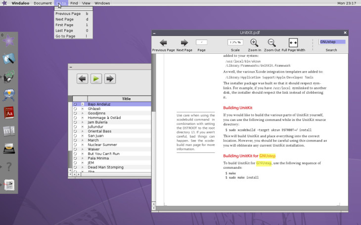
Is it just me or do you too suddenly see it as well? Etoile is very Mac OS X like but also unlike it at the same time.
When looking at the pictures (above) it reminds me of the way OS X used to look like a few years back, a global menu bar, a dock, applications as services…
Furthermore, Cocoa which is OS X widget’s toolkit (the API) is written in Objective-C and so does GNUstep (Etoile’s toolkit).
This is not a coincidence though, GNUstep which derived from OpenStep which in turn was the open source alternative to NeXTSTEP – the same one upon which OS X was built off of.
So similar design principles and similar technology, what’s the deal here?? Well, before you shout COPYCAT at it, let me just say that Etoile publicly declares in its vision information that they think:
“The User Interface Guidelines for the [Apple’s] Newton, in our opinion [is] one of the cleanest GUI’s ever produced.”
Square brackets added by me.
However, at the same time of which Etoile is being tremendously close to Apple’s OS, they are also found at the opposite edge. Since most of what Apple build / design is released under proprietary license, Etoile, in contrast is doing under MIT/BSD license.
Ok It’s Unique, Why Haven’t I heard Of It?
Truth be told I have no idea. I can probably speculate that it has to do with maybe the relatively small amounts of developers / contributers working on the project, or the short pace of advancement…
Who knows? it could also be referenced to the fact that this project is perceived as appealing to mostly natively French speakers or to the fact it diverge from the conventional desktop design.
Bottom line is anything is possible, yet that doesn’t mean it isn’t worth devoting more attention and contributions if you’re capable of by any chance.
I’m pretty sure the project members will be quite happy to receive any type of contribution you can give, and remember – contributing to an open-source project means contributing to the entire community.
For more about it, check out Etoile official website.


