Feature highlights
The new features presented in Switchboard 2.0 are part of both backend and frontend overhaul of the app, they include the switch for GModule instead of Xembed – this noticeably improves pane loading speed and also fixes graphical glitches (like black flashes). Beyond that, Switchboard 2.0 also takes advantage of GTK 3.10 features, like animating the transition between panes and using the new compact HeaderBar.
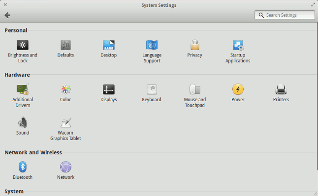
The grid view has also been through a bit of polishing to make it look nicer. For the record, and for those who aren’t using eOS as a daily driver, the following is to remind you of how the current Switchboard looks like compared to its 2.0 version, check out the image below.
Isis is still in development
Unfortunately, if you are an early adopter and like to already give the new Switchboard a try, you’ll have to keep patience, since Isis is the codename for the upcoming eOS release, version 0.3, and there is no publicly available snapshot of it yet.
Working by the “release when it’s ready” model, there’s no knowing for when this version will become stable or usable, but that’s part of eOS declared procedures for making it as beautiful and stable as it is today.
Last but not least, here’s a short video demonstration of Switchboard 2.0, enjoy!

