Commonly Clicked Features Belong at the Edges
The corners and edges of the screen are proven by Fitts’s Law to be the most easily reached targets.
However, even without a scientific explanation for that phenomenon we can understand that by using common sense; dragging your mouse to a centered point on the screen will require you to slow the movement down in order to hit the target.
In contrast, hitting a spot located at the edge of the screen, corners in particularly, can be done with maximum speed at hand, since no matter how fast your hand will go, the moment the mouse reaches the edge – it will stay there until you’ll move a different direction.
Here also we have tiny nuance we can refer to, such as: right handed people will often feel more comfortable with right edge corners and vice versa.
A good use of this concept is made by: Unity power menu, GNOME power menu and activities button, OS X apple button, Windows start menu and show desktop function…
Big Buttons, Consistent Placement
In order to increase the attractiveness of the desktop, a standard size, good looking icons may serve as an eye candy for the desktop.
Not many would argue that, for example, XP’s Taskbar is a lot more eye catching than OS X dock, and for obvious reasons that is – big, well designed, colorful icons are much more eye candy than a simple rectangle frame with text in it.
It’s also much easier to remember and differentiate between, once you’re familiar with the icons and even more so with their constant placement.
Therefore, Windows 7 omni-Taskbar is much more superior to its predecessors and also to OS X dock from a coherency perspective; upon removing / adding items to the dock it expands and the whole set of icons move a little.
This hinders the working memory which responsible for a faster, more fluid movement towards the goal – clicking the desired app icon. Unlike the omni-Taskbar which largely moves in one direction alone.
Tabs, Menus and Window Controls Can They Live Together?
One thing’s for sure – it’s a tough question – I haven’t the slightest doubt about that.
However it seems that finally after quite some time has passed since I’ve started asking myself that question, an answer has emerged out of its hiding place.
At the first time when Google’s Chrome browser was presented to the world, people were in awe about its innovative looks, no one thought back then, that tabs could live at the same level as window control buttons (close, minimize, …) are.
This in turn, had sparked other browsers to do the same and also search for other design features which could bring into play more of this minimalistic yet maximal utilization approach.
Think about it, by moving tabs to the title-bar the user gains not only about 10 – 20 pixels of height but also multiply it by the screen width – it becomes a significant gain.
Hence, to further increase the efficiency of our precious screen space, moving the window menu into the title-bar as well could make a tremendous leap forward and a step in the right direction.
But how can we do all that without burdening and cluttering the UI? Well, Chrome is an example of how that could happen, however it’s an example I personally disagree with.
The 3-bars icon which is used by Chrome to represent the window menu is IMHO the wrong way to go and here’s why: many websites, including iWillFolo, incorporates the same icon to represent their own menu for certain screen devices.
Therefor it can be quite confusing sometimes and may cause users unintentionally press the wrong icon.
So how can it be done the right way then? Ironically, a major organization has already adopted the idea but has for some reason, neglected it in favor of the 3-bars.
I’m talking about Firefox of course and the way its menu looked a couple of versions before, with the menu appearing on the left side, easy to distinguish and functional nonetheless.
So yes, Tabs, Menus and Window Controls can live together side by side for that matter.
Customizable Customizable Customizable !!!
Finally, above everything else that’s been said here, there’s also one fact that the ultimate desktop can’t ignore of and that’s people like to customize.
Even when you give people the perfect designed desktop served on a golden plate, folks will always love to add their own personal touch. [and that’s great they do]
Besides, let’s not forget that trends are changing frequently, what’s popular today may be tomorrow’s boring history, thus incorporating convenient customizing features are the ultimate desktop obligatory trait, without it – it’s as useful as a shiny old trophy.
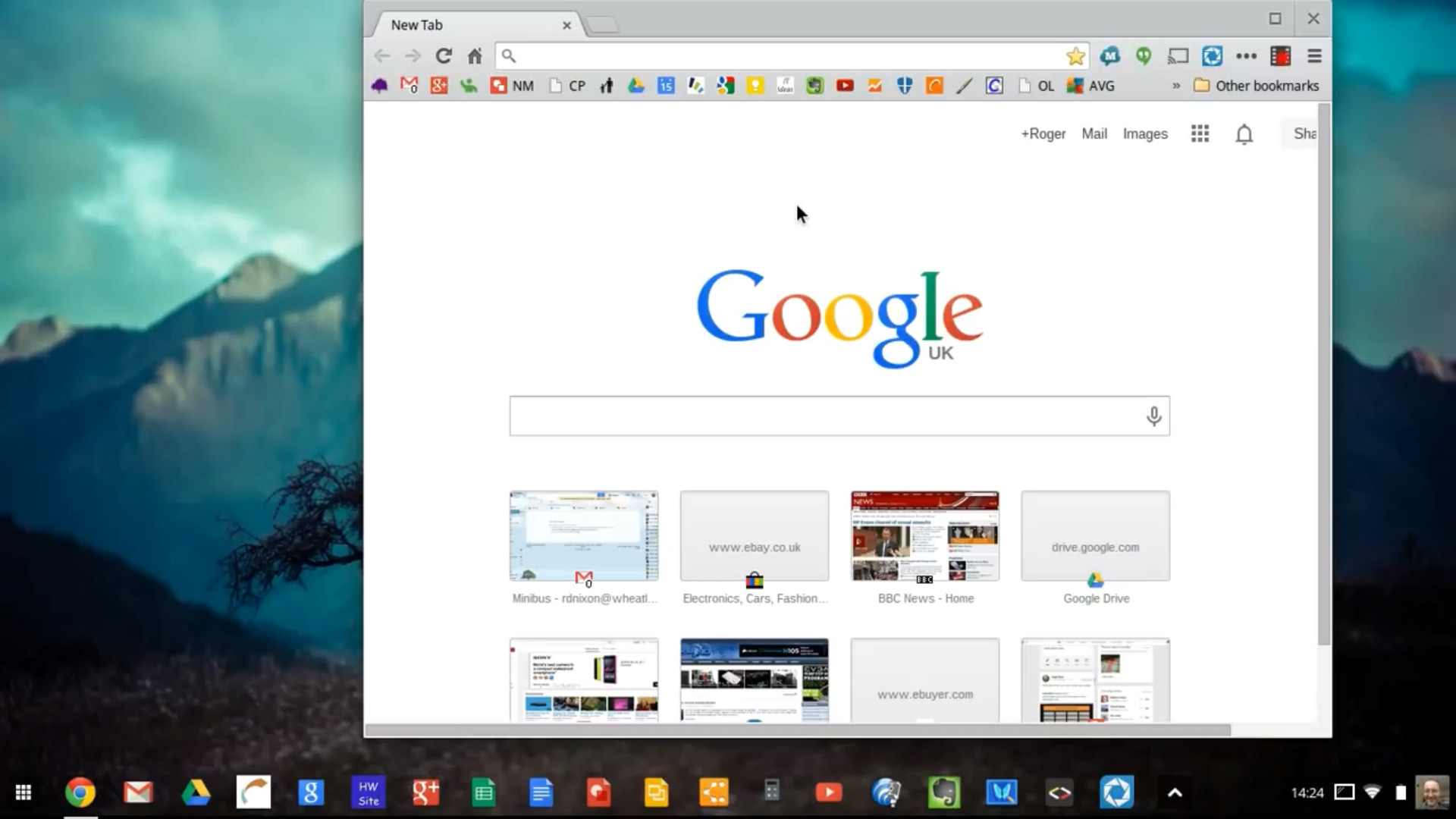
Oh yeah, I almost forgot, below is a photo of how my current desktop looks like, and as for the vision image I talked about at the beginning of the article – that image is also there at the beginning – nice isn’t it?

Images: File Explorer, Chrome OS.